9 — Give clear feedback
If you intentionally perform an interaction but it’s met with no response, there can be a pang of anxiety, a shot of frustration, or maybe even mild panic.
You don’t want your users to associate these feelings with your app.
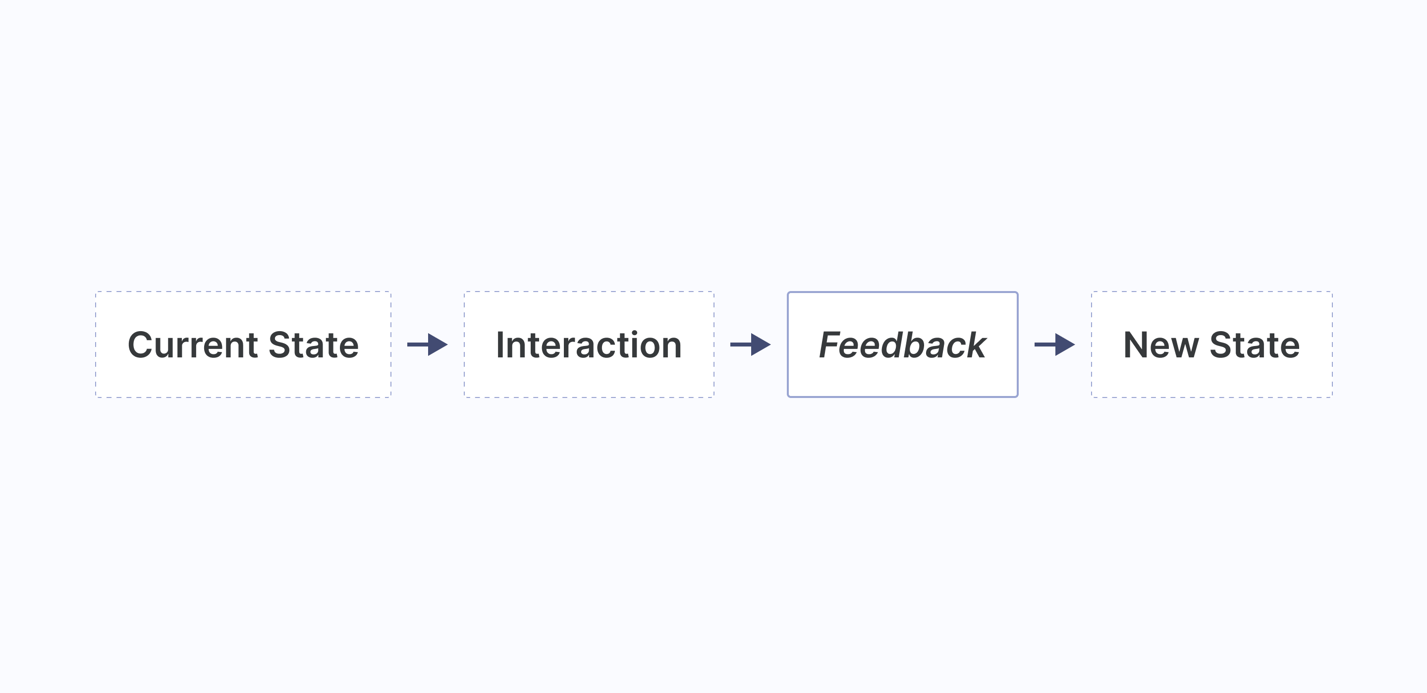
Every interaction has a lifecycle and an essential part of that is showing useful feedback on what just happened. The feedback should be obvious, relatable, and quick.

The feedback of an interaction should be telling the user something and that something can be broken down into four categories.
- Information — The new status resulting from the interaction
- Success — That an interaction was completed without a problem
- Warning — Cautionary advice that arises from the interaction
- Error — A problem that has interrupted the consequence of the interaction

Providing feedback can come in many forms. In the real world, it’s the light that comes on when you put on the kettle or the status on screen when you turn the dial on the microwave. In apps, it’s the handy progress bar when an interaction starts the upload. It’s the cheery confirmation message when an interaction has been successful. It’s the informative error alert when an interaction has caused a problem.
Takeaway
Your app is full of interactions. They’re everywhere. To make those interactions feel responsive and engaging, they should be met with clear feedback. Without clear feedback, feelings of frustration and anxiety can occur quickly. It can be even more important when an interaction is the result of a heavy decision, like paying for something. Providing good feedback is about making your users feel trust, feel in control and feel assured.
Further learning topics: Feedback

