4 — Navigation as contexts
Hopefully, you’re seeing that it’s powerful to break things into objectives, made up of discrete actions. It helps you experience those steps your users take when embarking on the various journeys through your app. But like any journey though, there are stopping off points along the way.
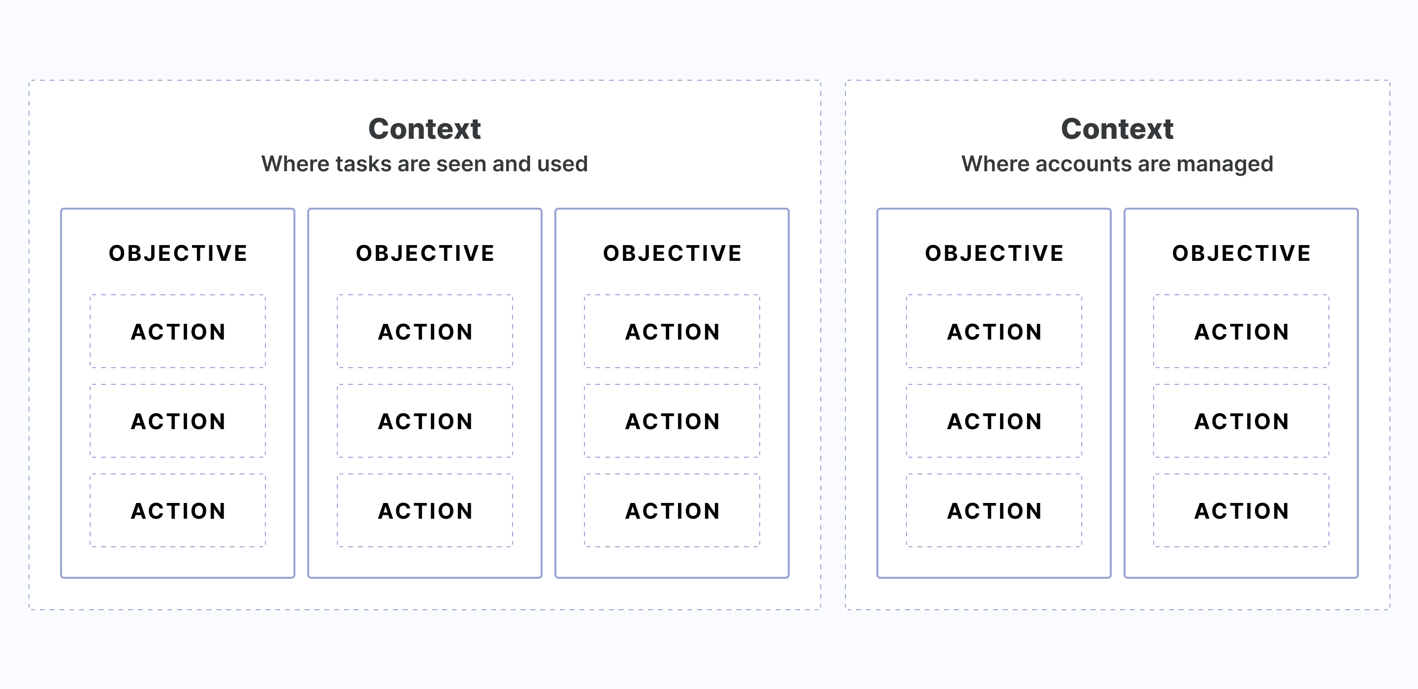
How to determine what goes where in your app is important but also tricky to balance sometimes. A general rule of thumb is defining where contextual, related behaviours are expected to take place and then group from there. Let’s say you want to meet up with friends for a night out. The goal is to “go out with friends" and the positive outcome could be to ”feel less stressed by having fun”. On this epic quest, one of the destinations is a cinema. Within this cinema, the objectives would be to “decide what to watch”, “order tickets for the film” and “watch the film”. Those feel like related objectives which are part of the bigger goal of going out with friends but would have little relevance to your next destination: the bowling alley.
Things can get tricky when a place tries to do too many things at once. I’ve never heard of a cinema that has a bowling alley down the central aisle. Confusion and frustration will surely occur, for both moviegoers and bowlers alike. Something usually gets compromised and it’s best to keep it separated.

The key is to group your objectives and actions together in a way that feels relatable and meaningful. With your list of objectives, there are bound to be common themes between them. Maybe a group of them relate to the user’s account. Maybe some relate to the transactions in your budget app. Maybe some relate to the labels in your todo app.
Every time you present a screen to the user, their brains are screaming the following questions.
- What is this? Is it easy to comprehend and understand?
- What can I do with it? Are the available actions discoverable and clear?
- How does it help me achieve my objective? At the end of the day, that’s all it’s there for.
Take a fresh look at what you’re presenting and see if those questions can be answered.
Takeaway
Your screens are the contexts where relatable objectives and actions happen. Sometimes they may contain one objective, sometimes they may contain more. Simply mapping screens to how you’ve organised your app’s database is rarely the best way to go. Think about what objectives and actions feel related enough to warrant being shown at once.
Further learning topics: Information Architecture

